ADOBE INDESIGN * ADOBE ILLUSTRATOR * ADOBE PHOTOSHOP
University Project 2020
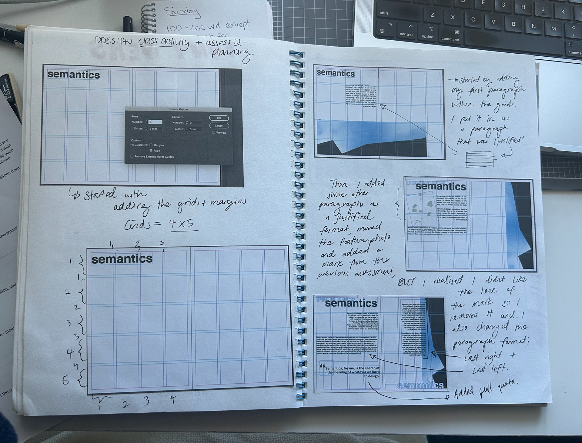
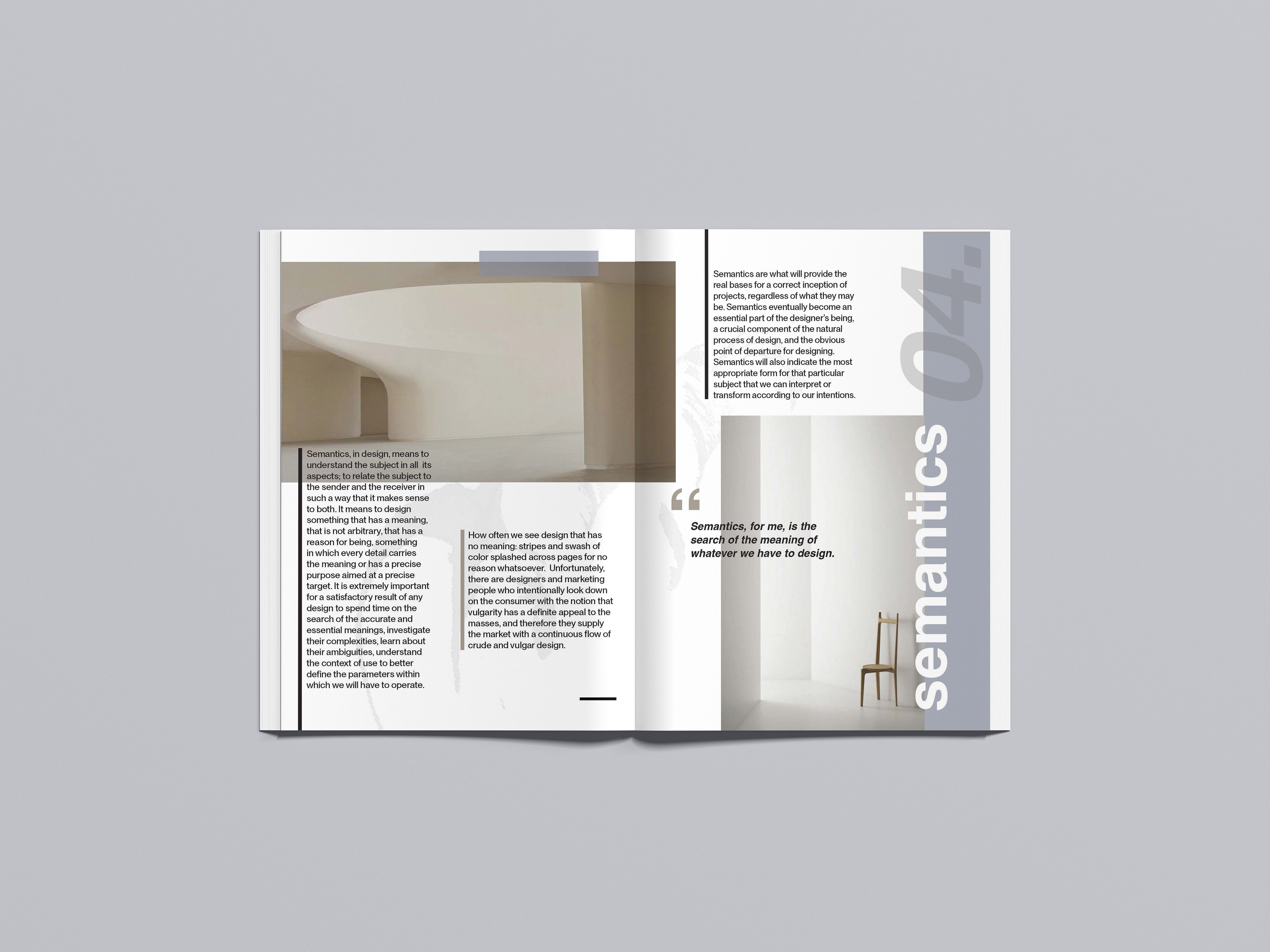
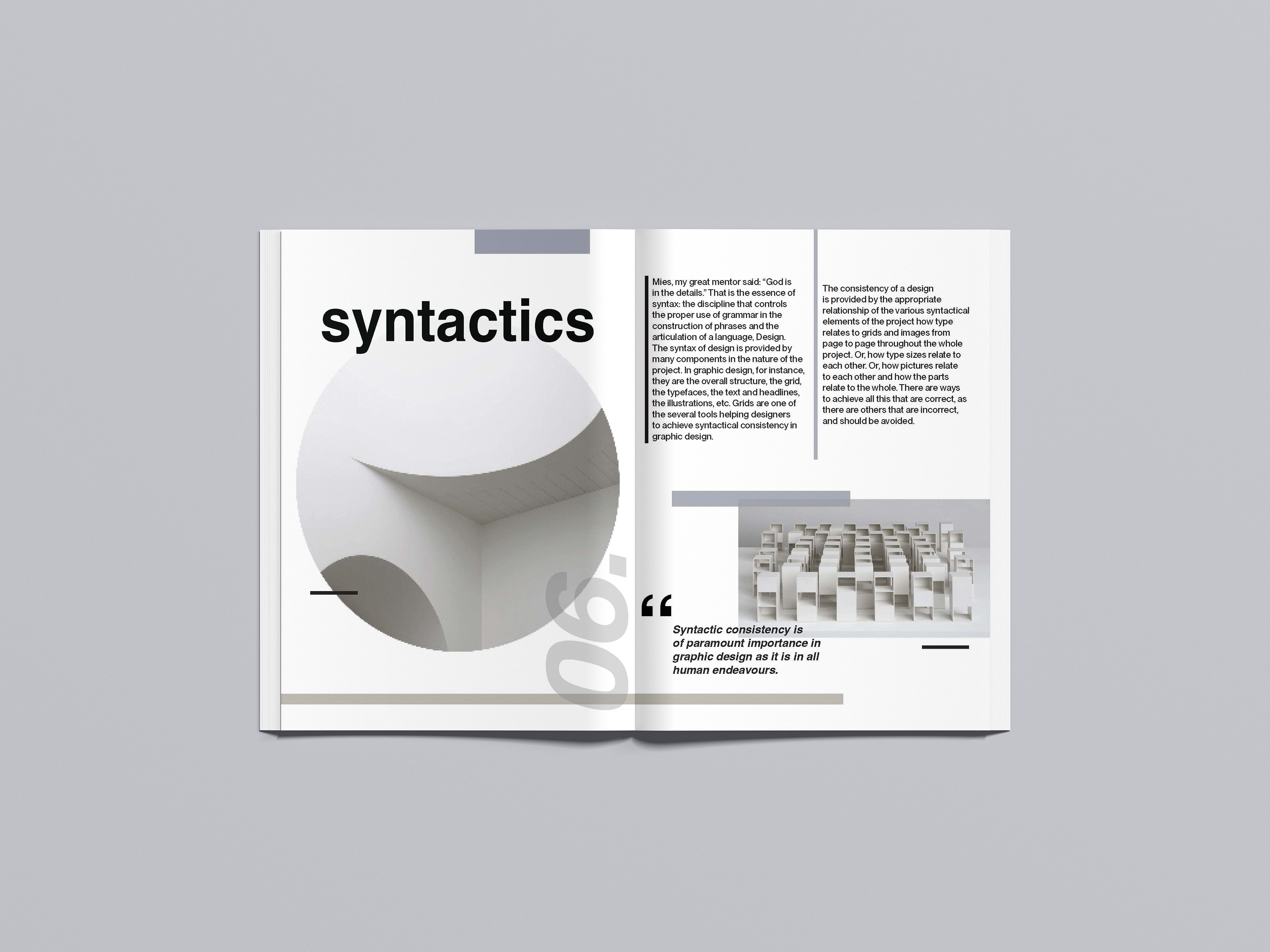
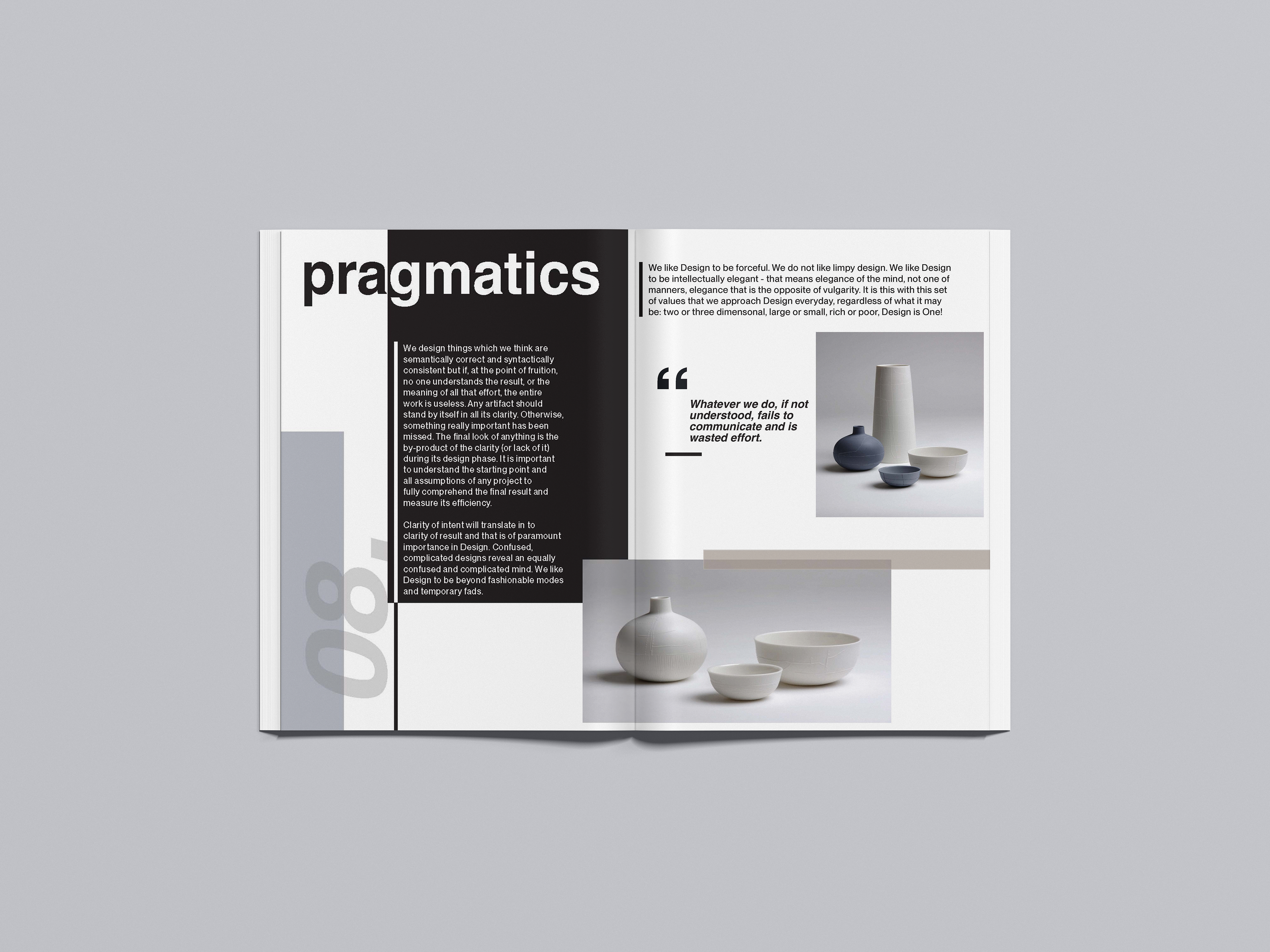
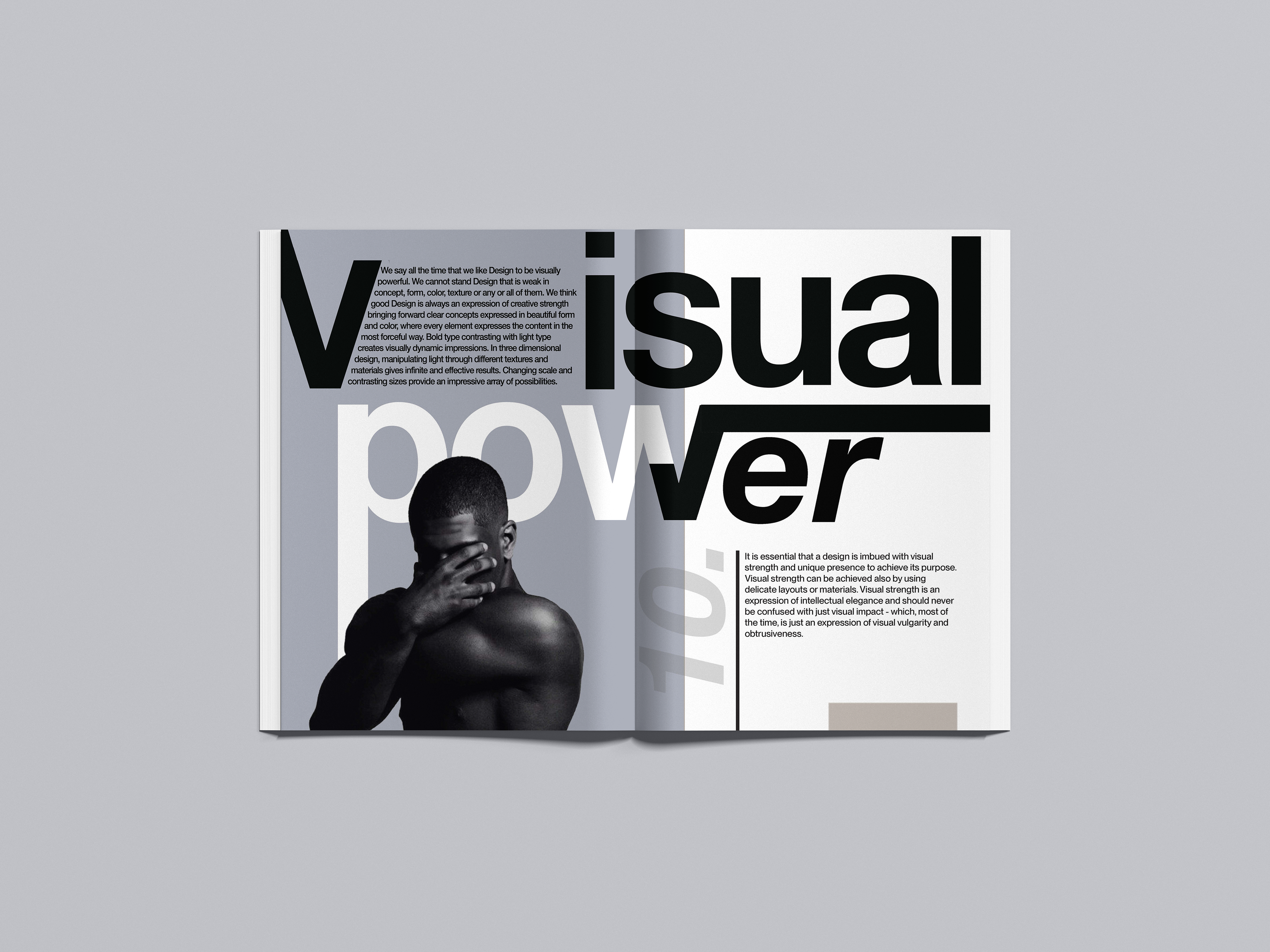
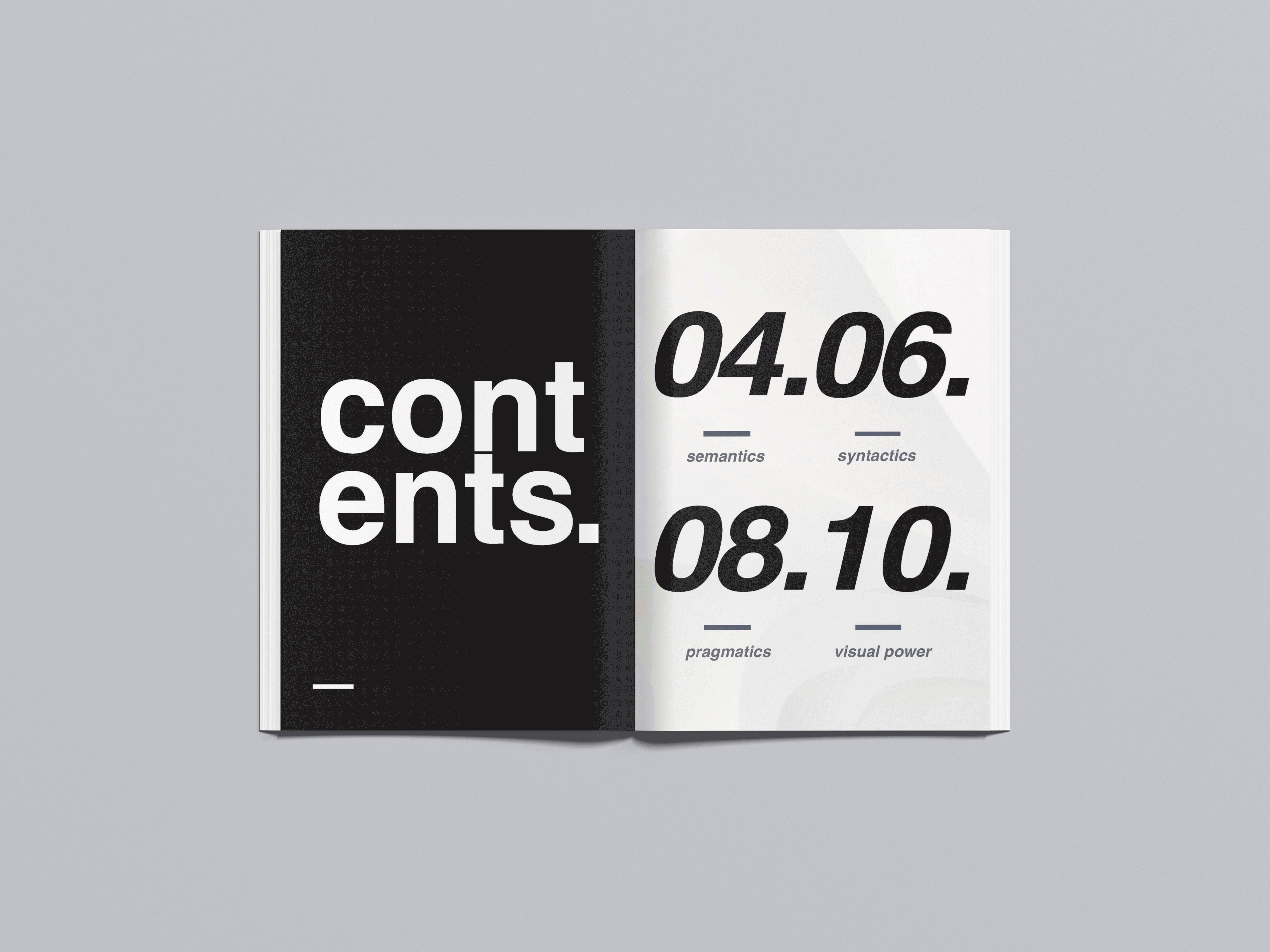
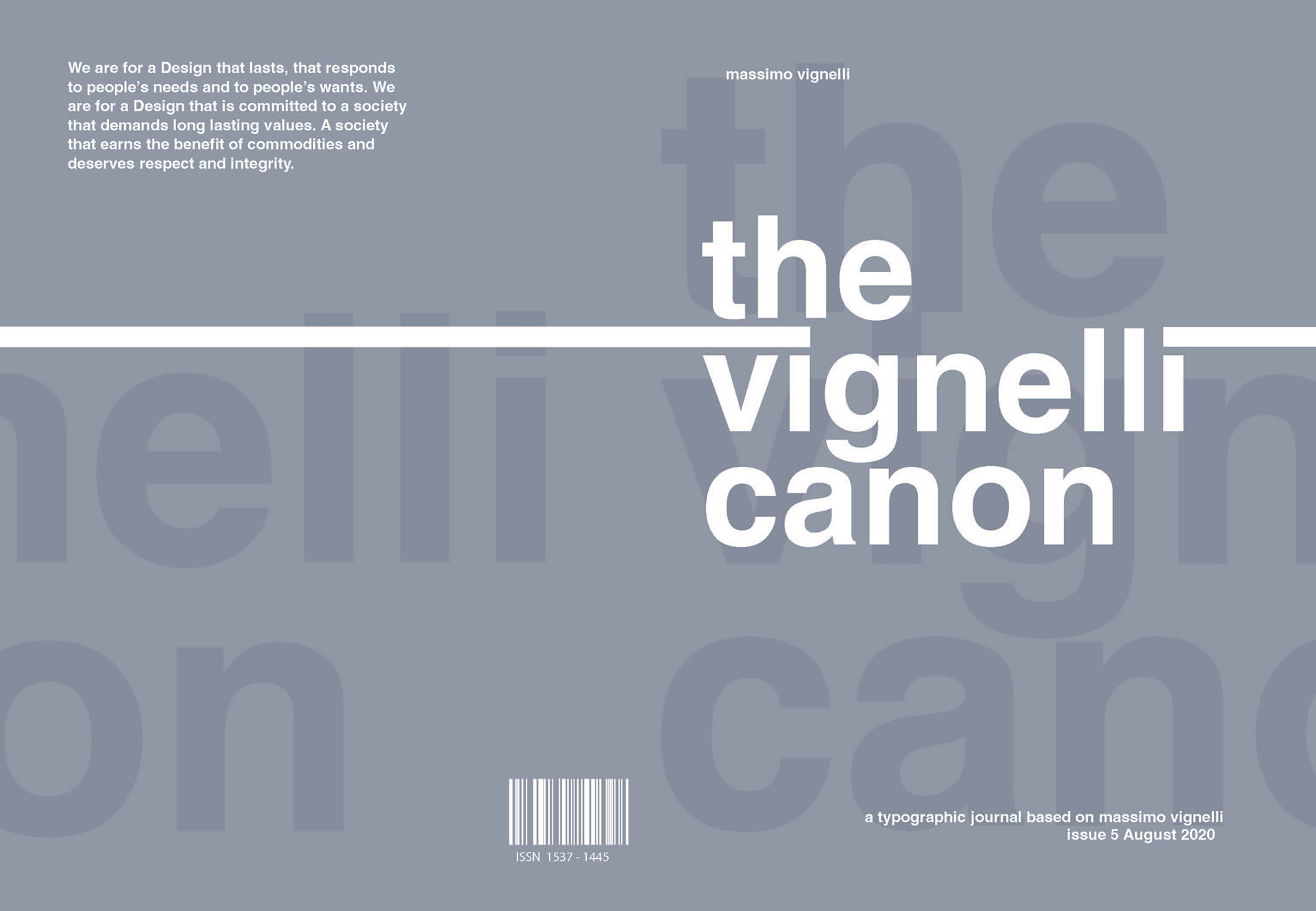
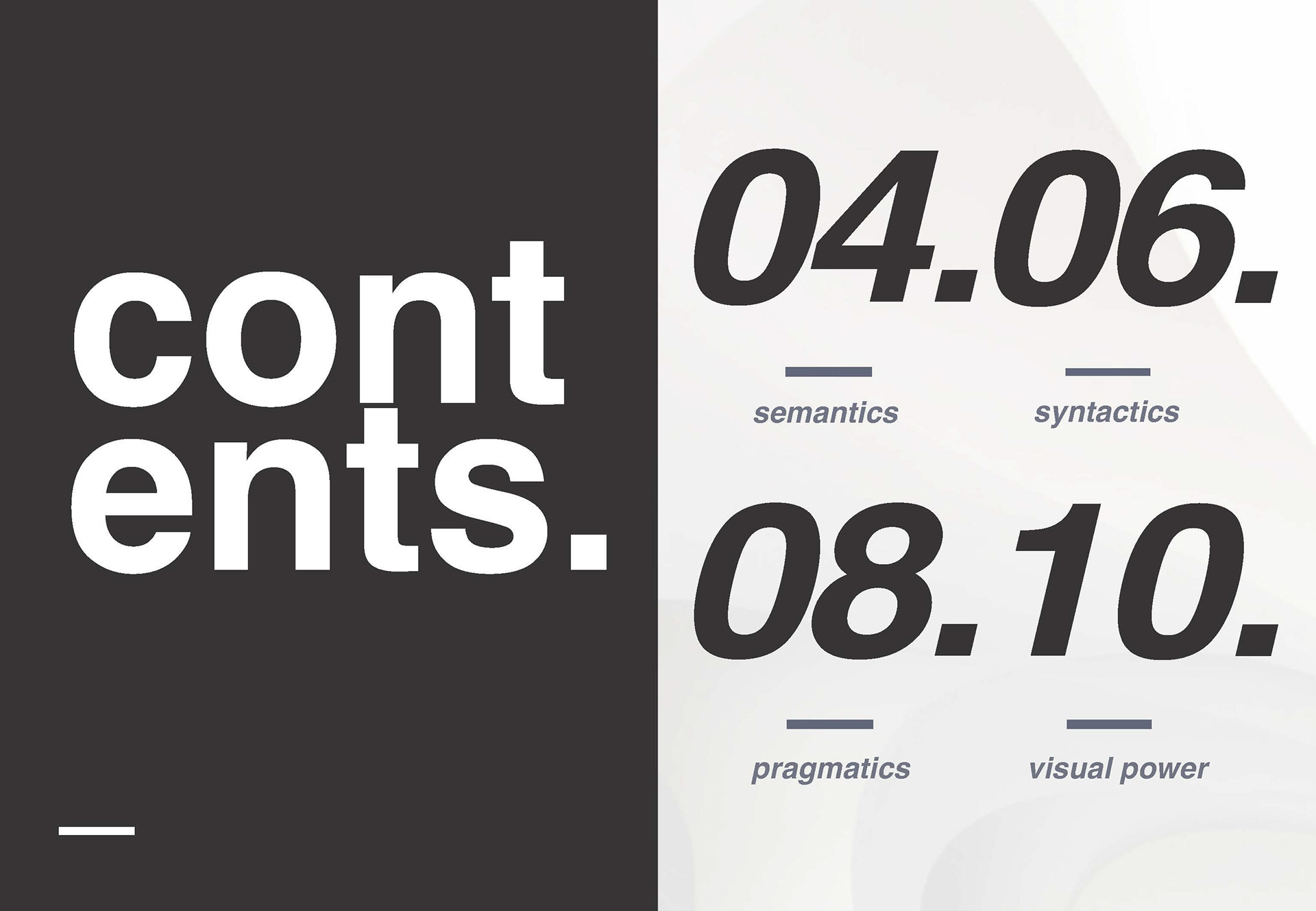
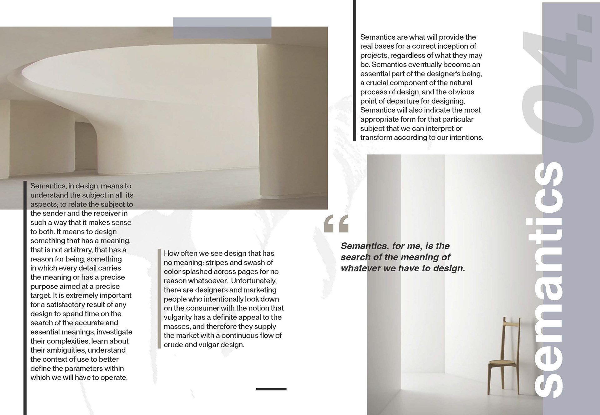
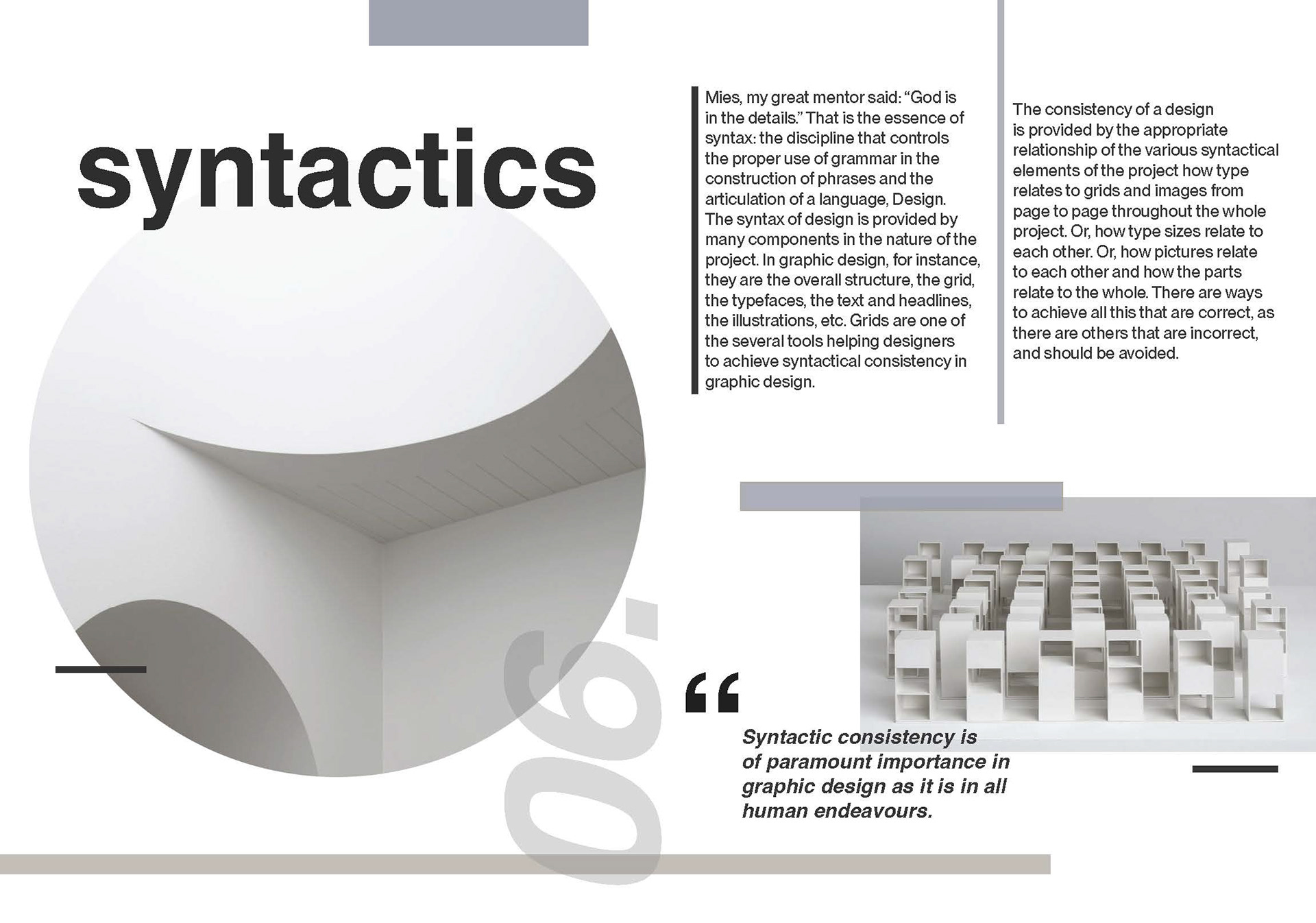
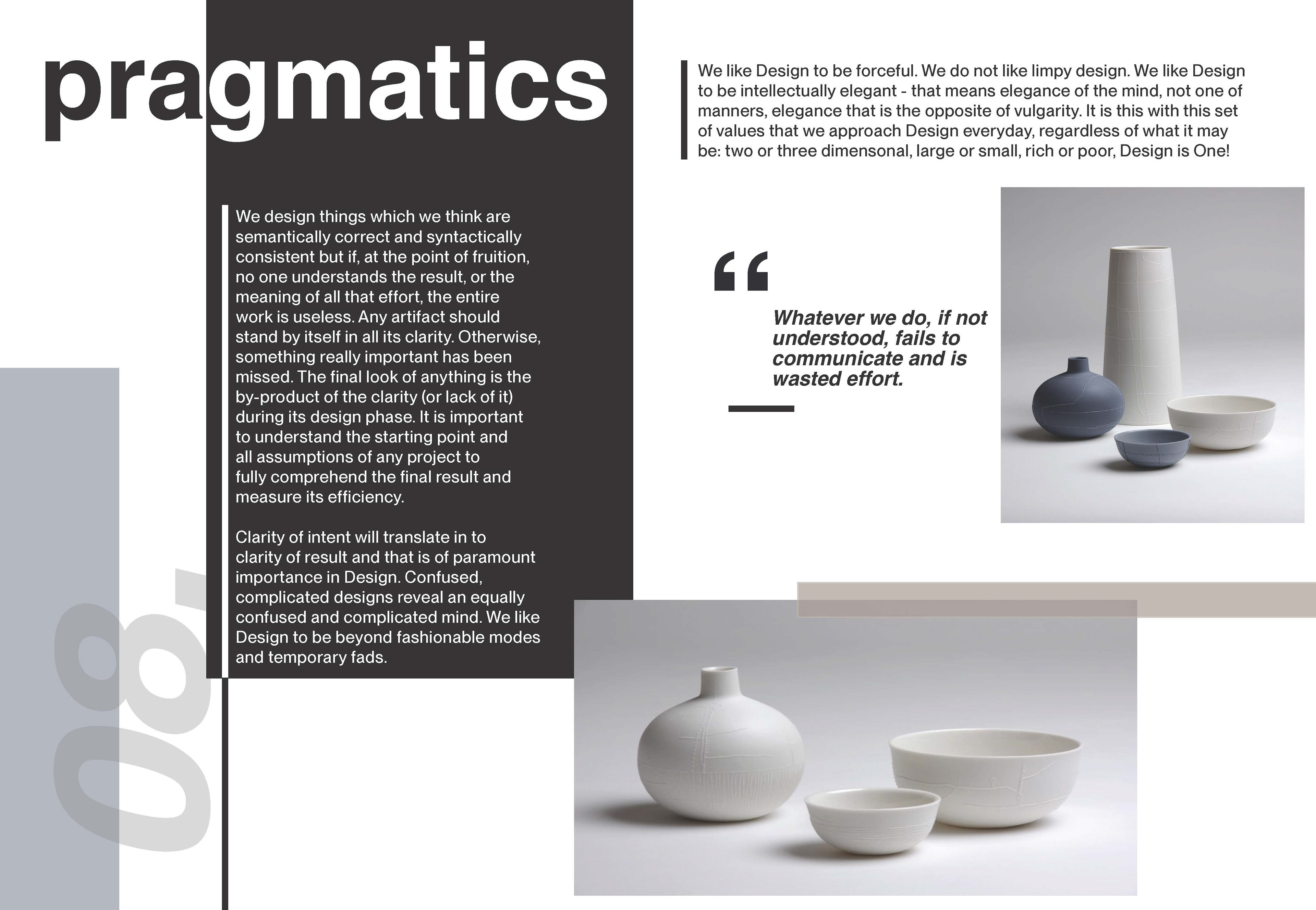
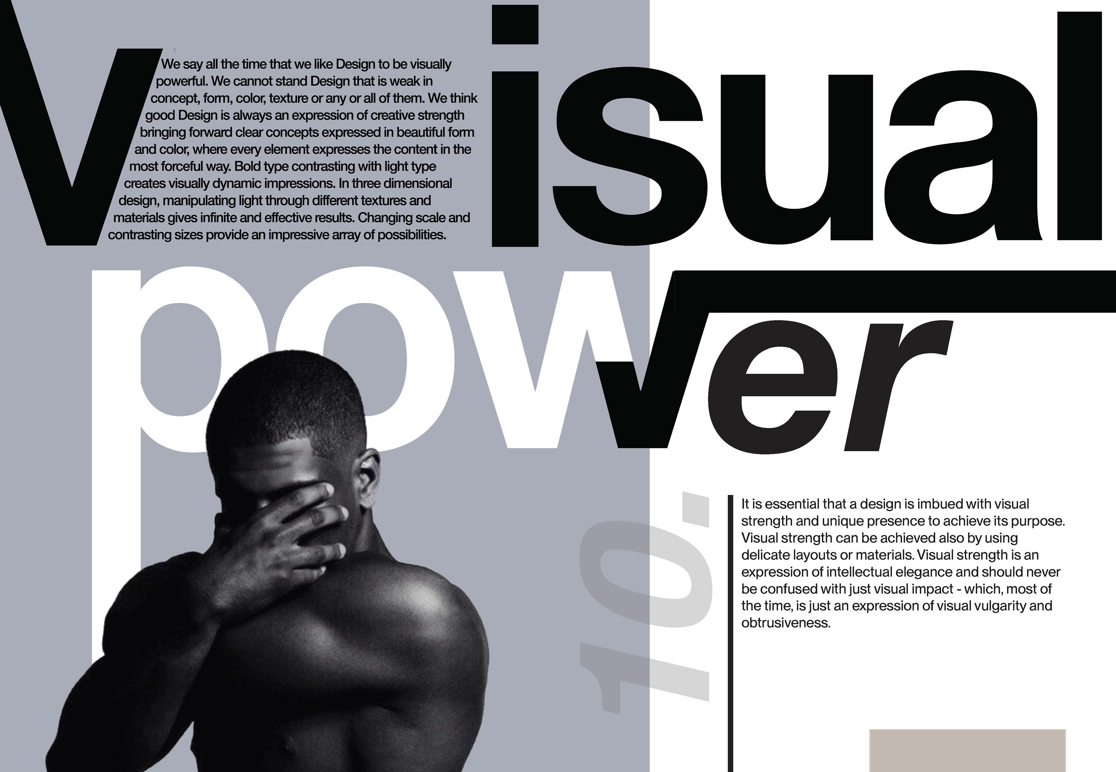
This project was an exploration into the fundamentals of typography, focusing on text and image layout. I created a mock-up of a typographic journal, blending creative flair with design fundamentals. The design process was iterative, with regular feedback from peers and tutors, culminating in a final review that assessed the publication design, design process, and course reflection.
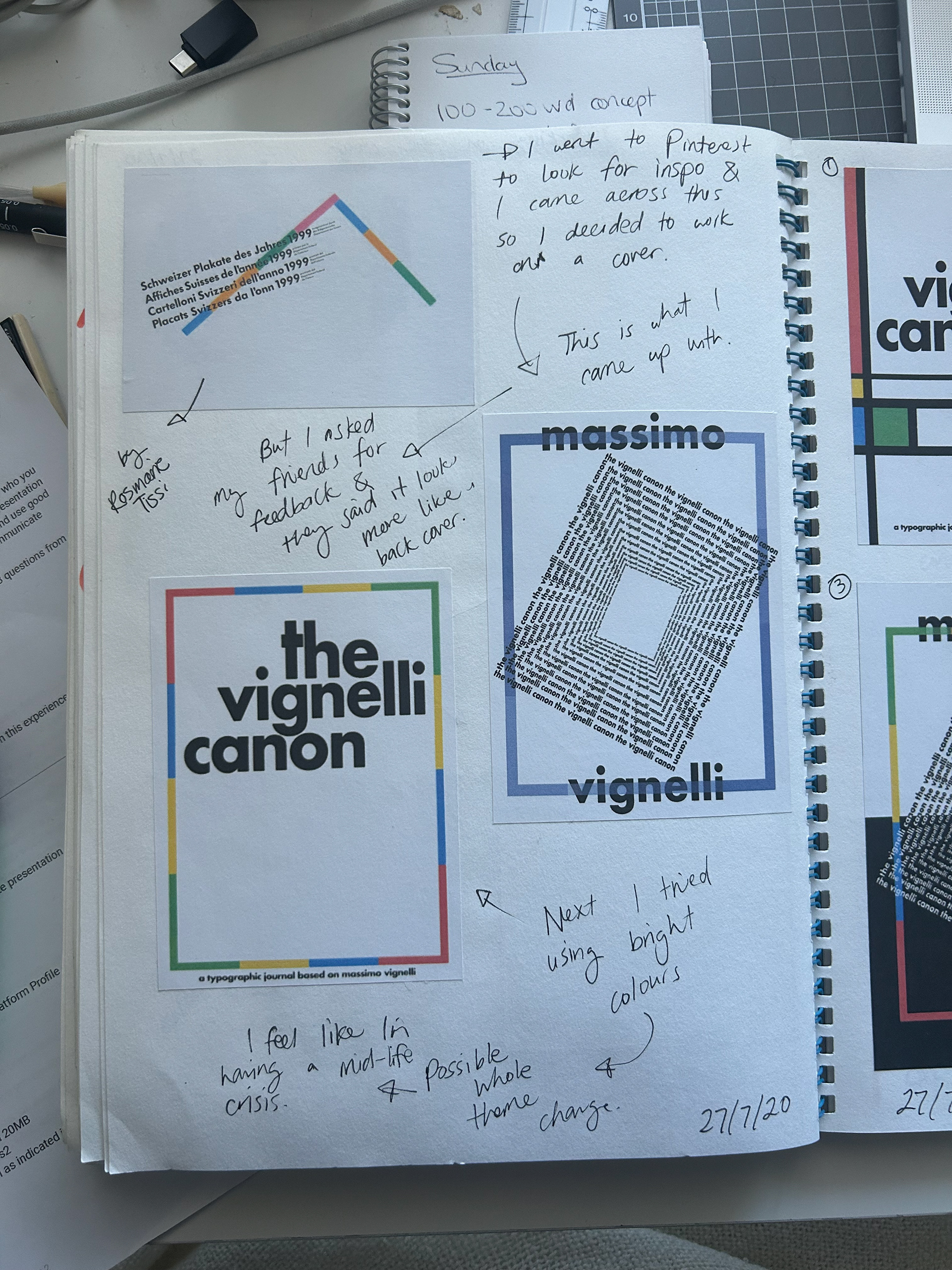
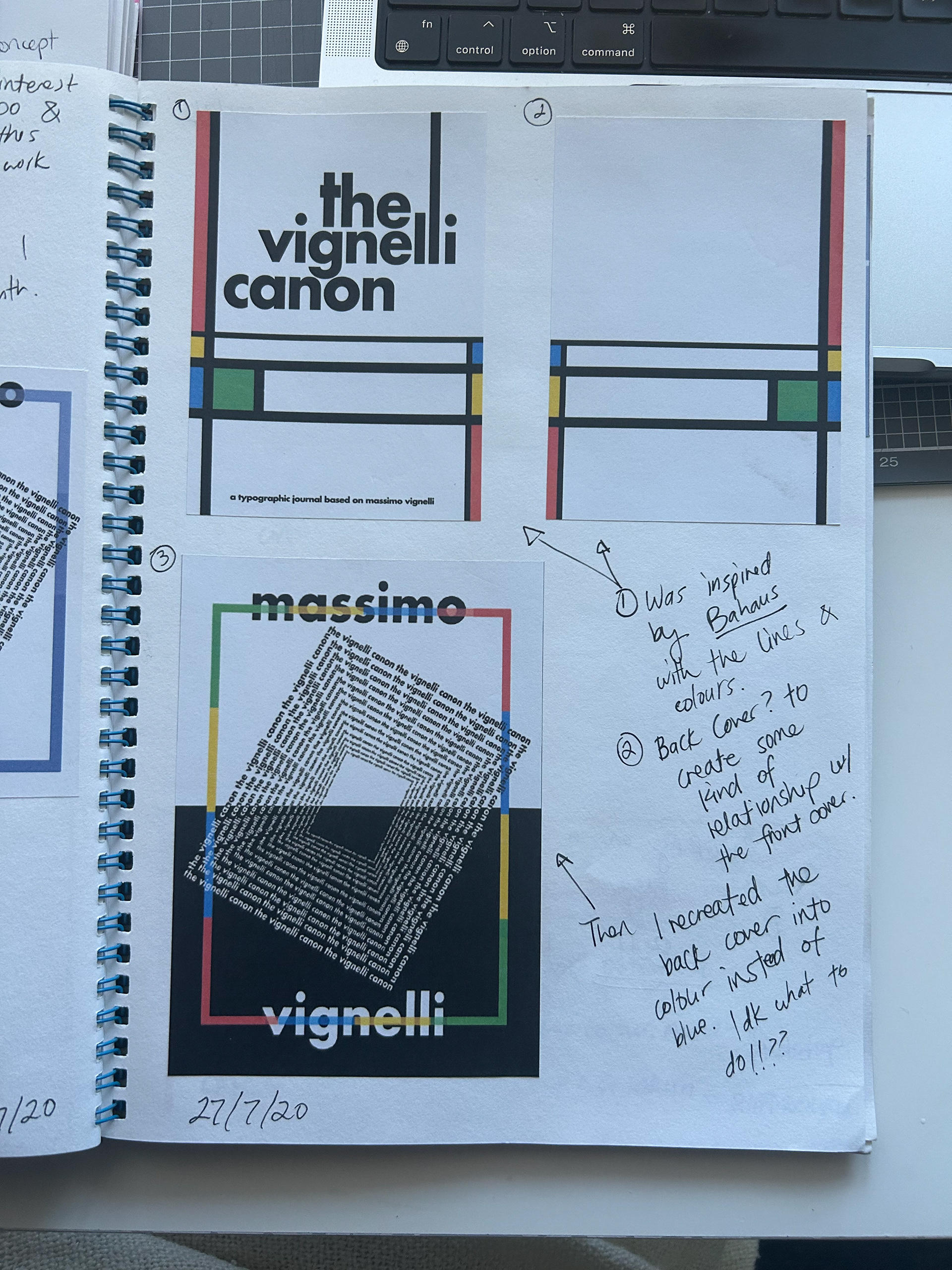
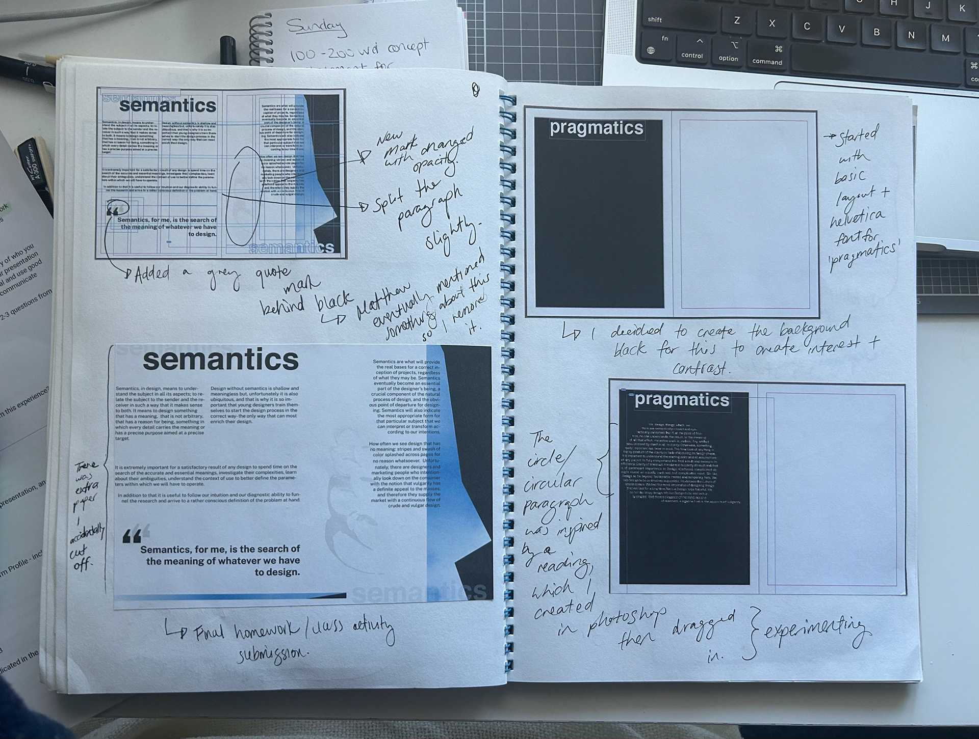
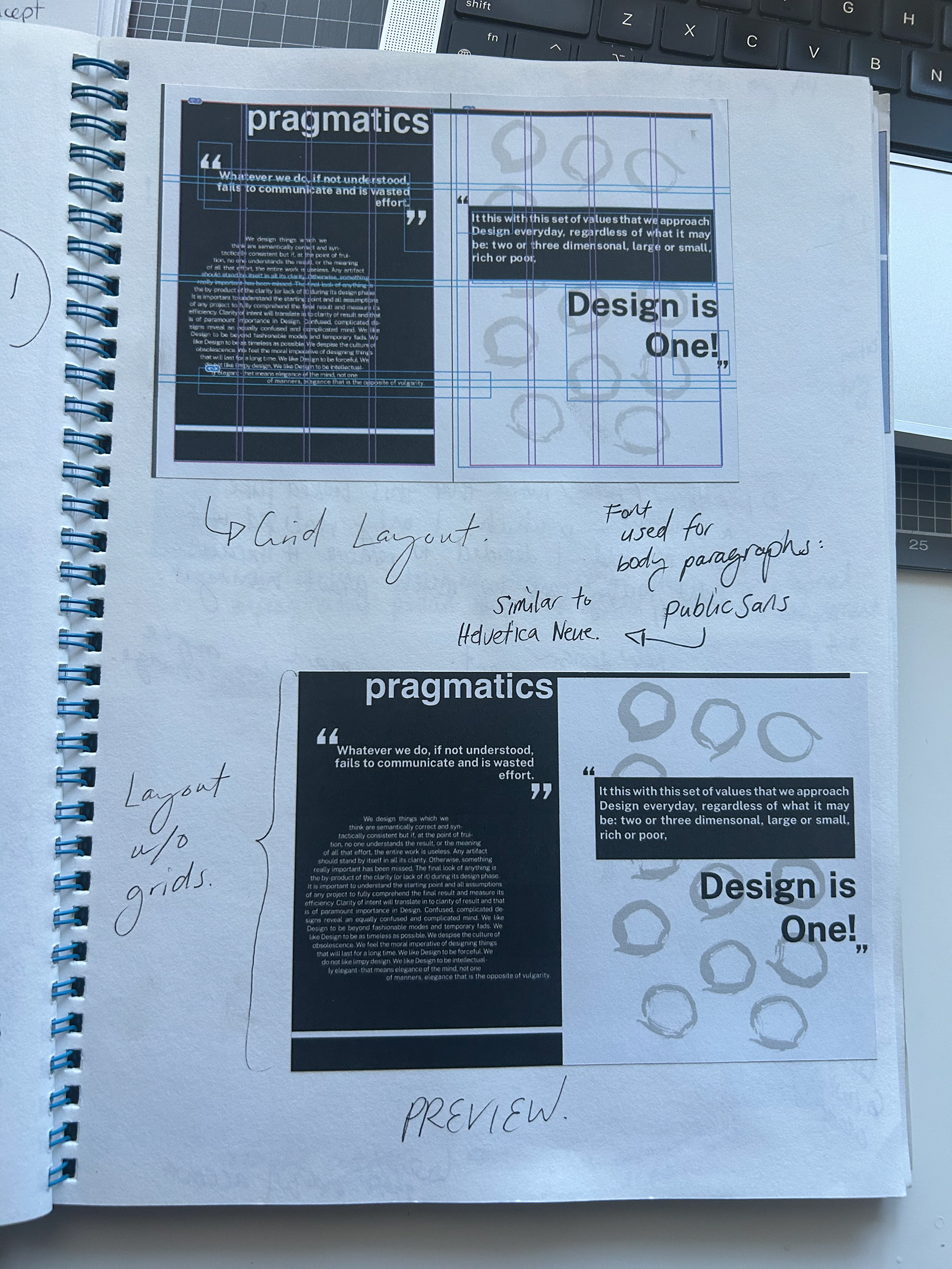
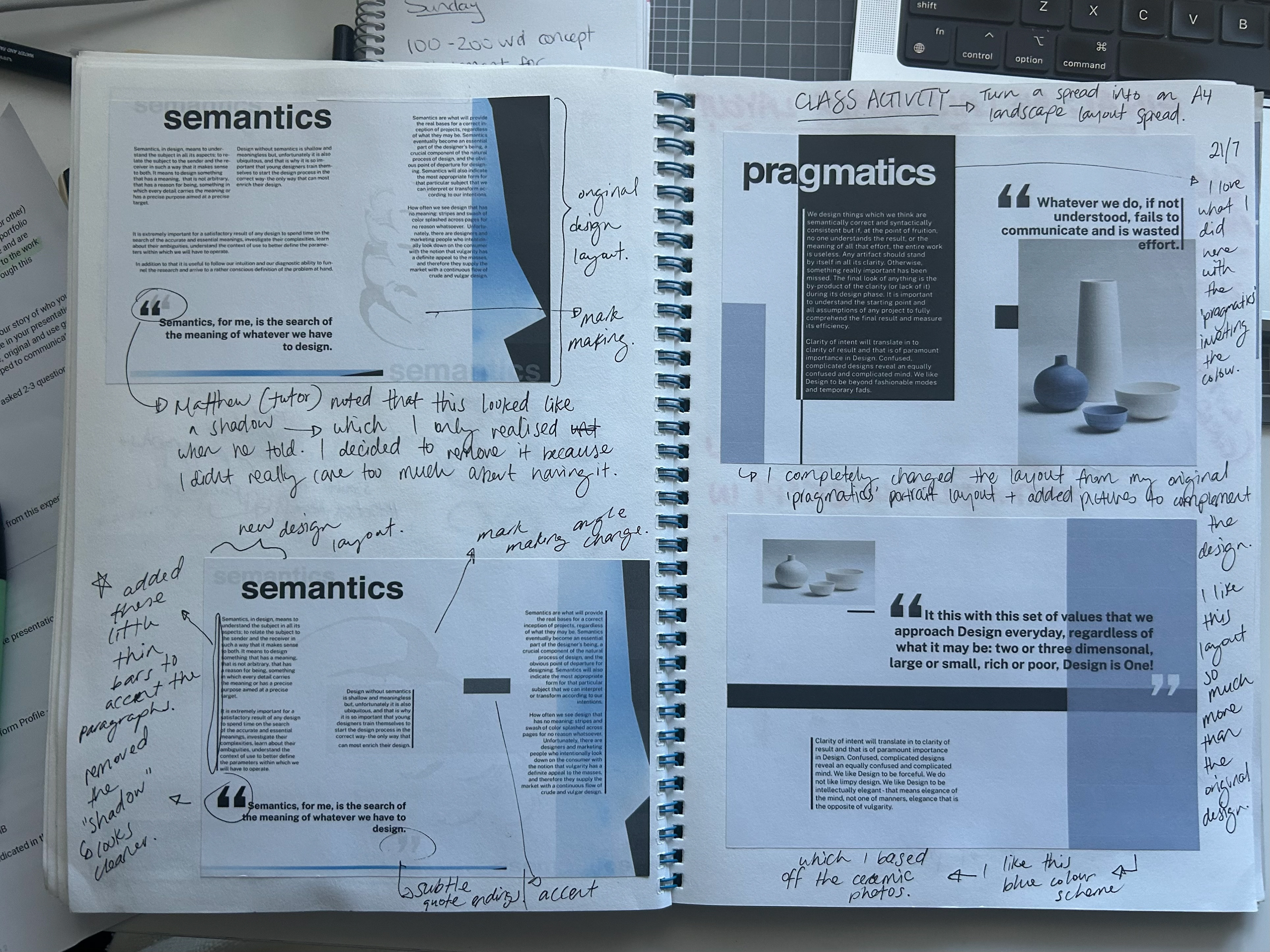
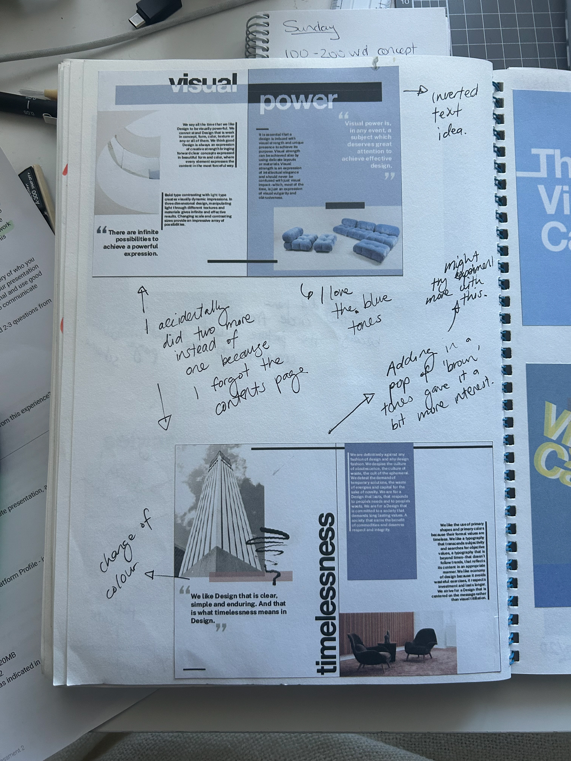
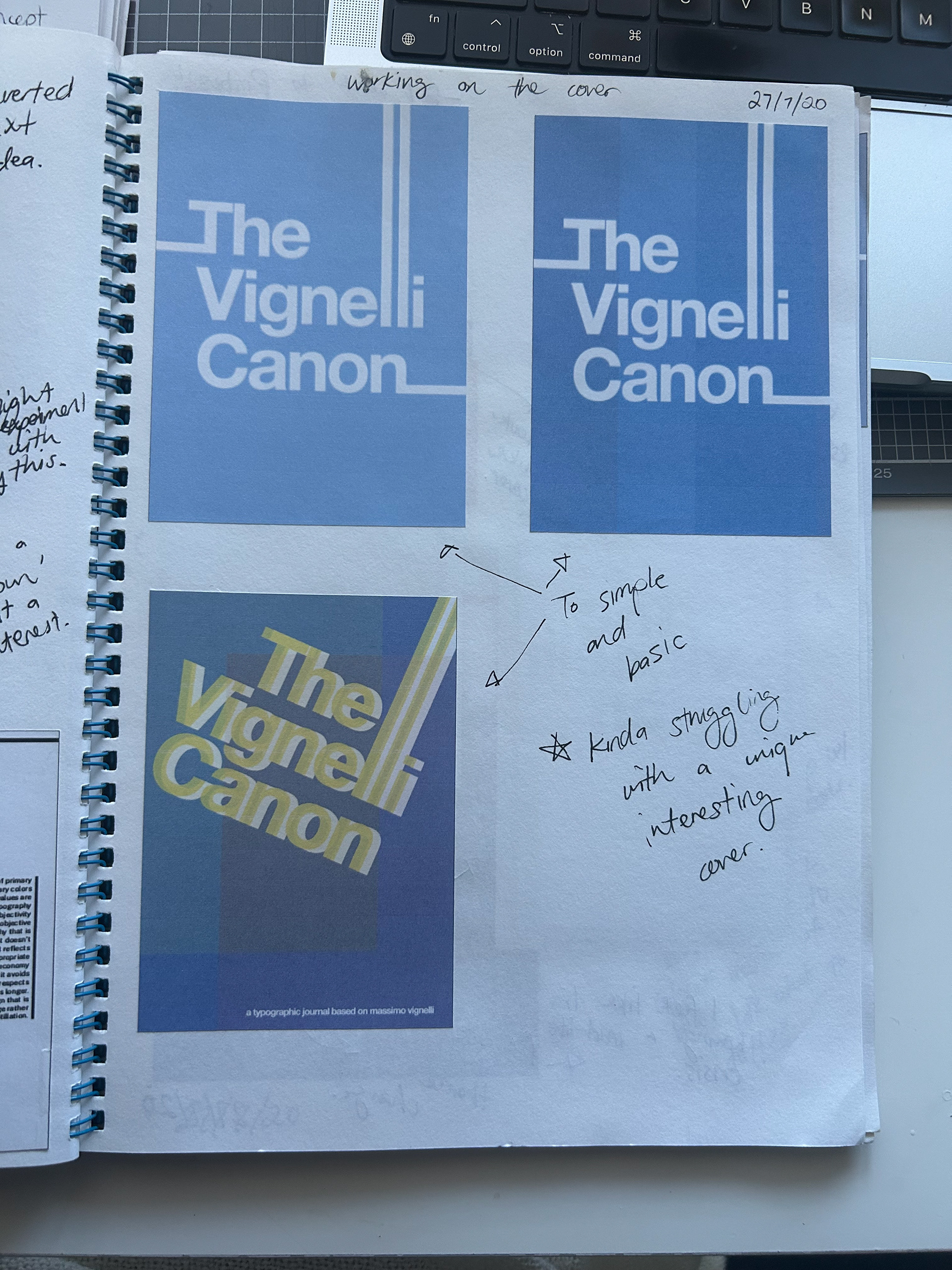
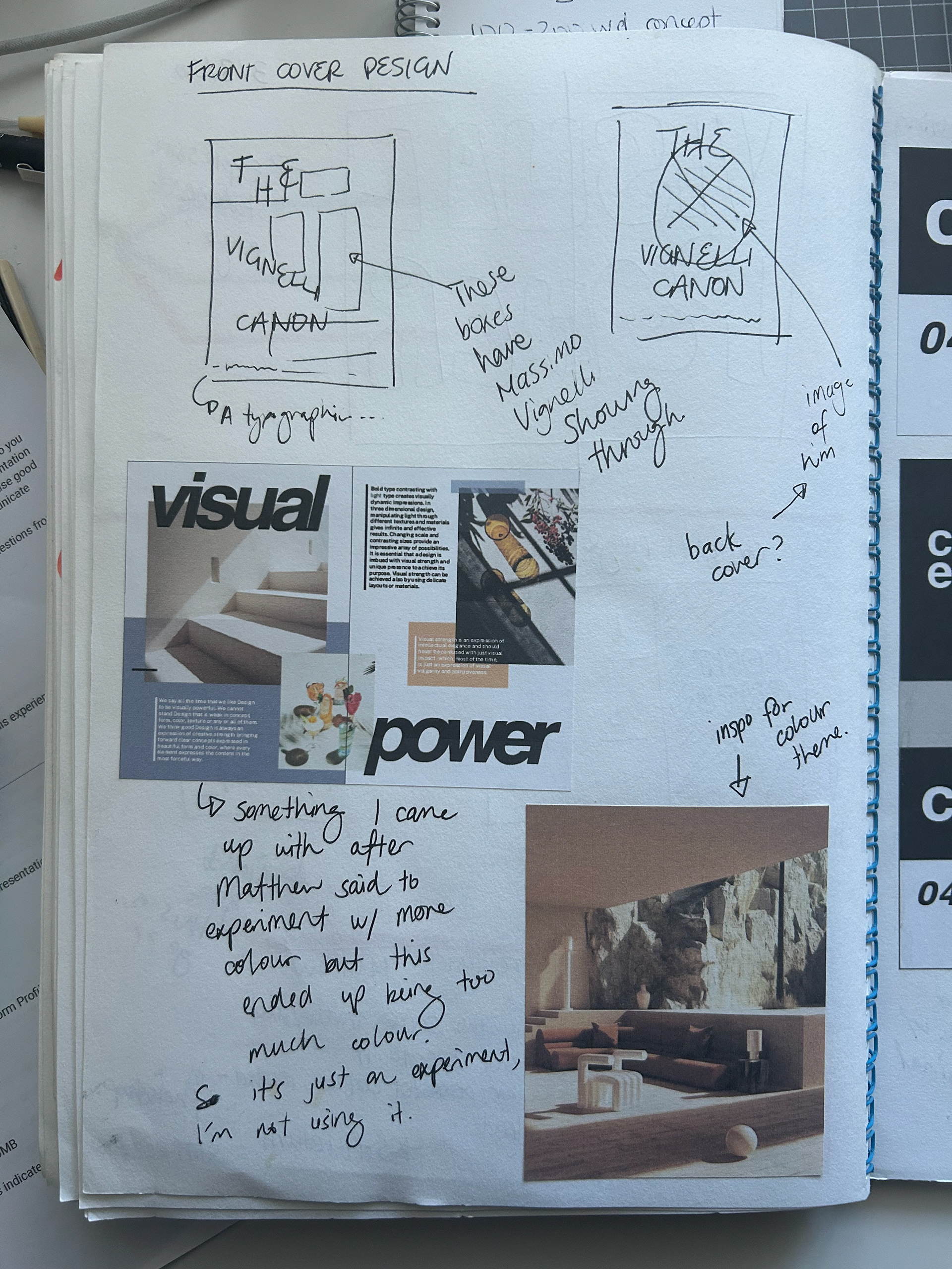
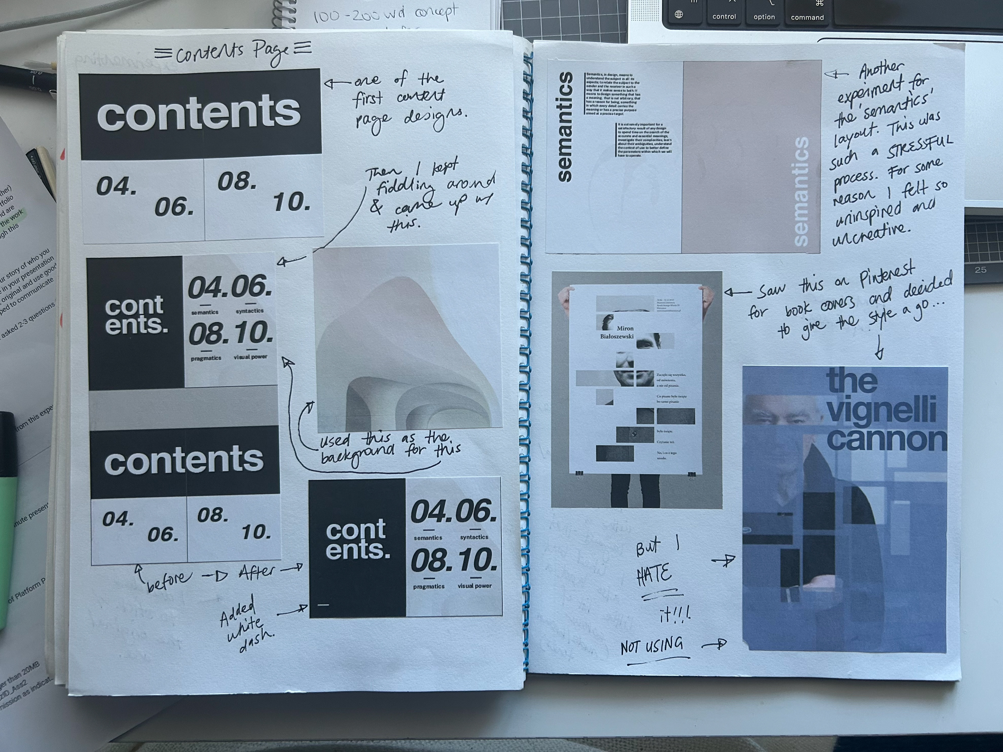
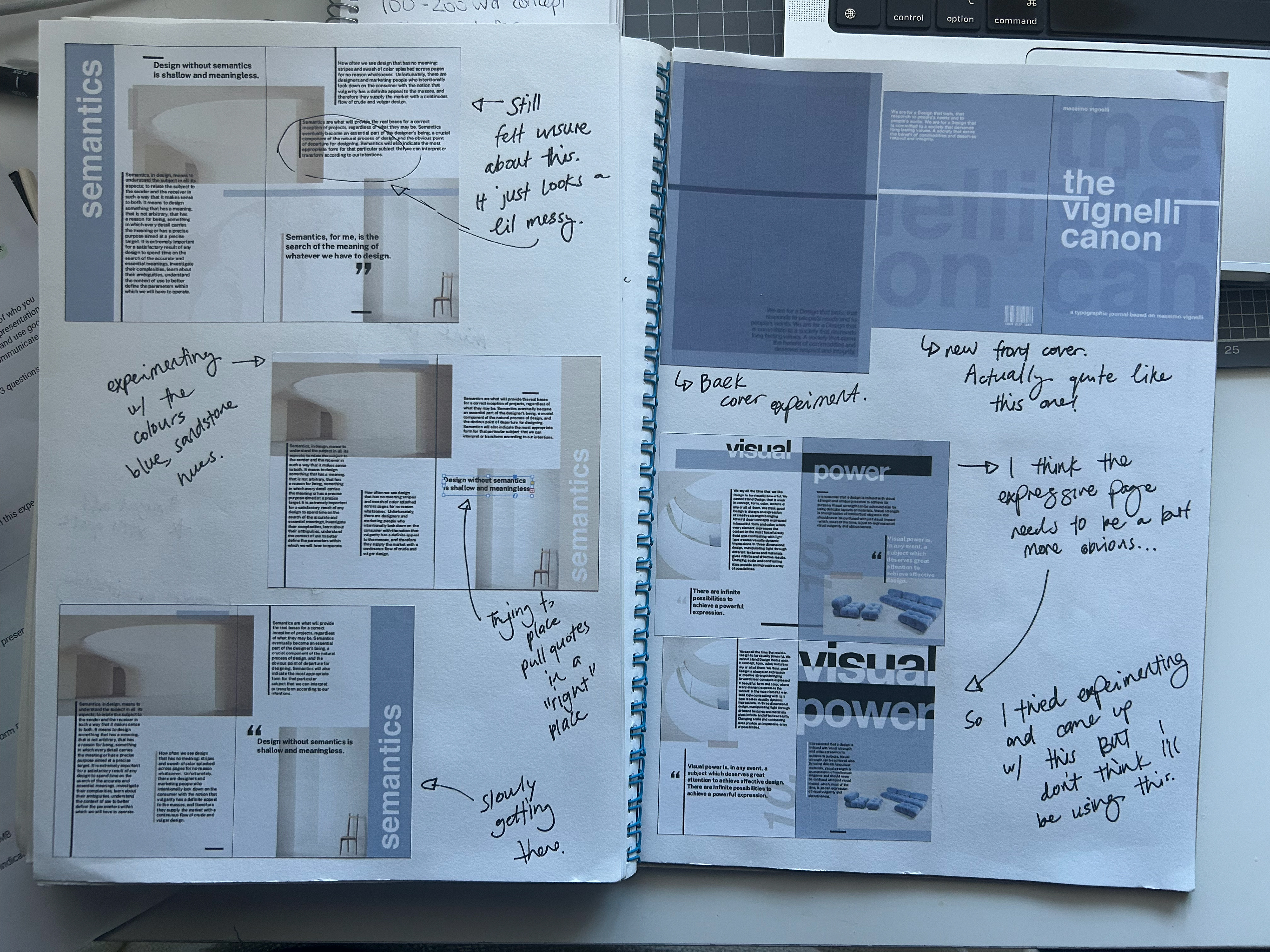
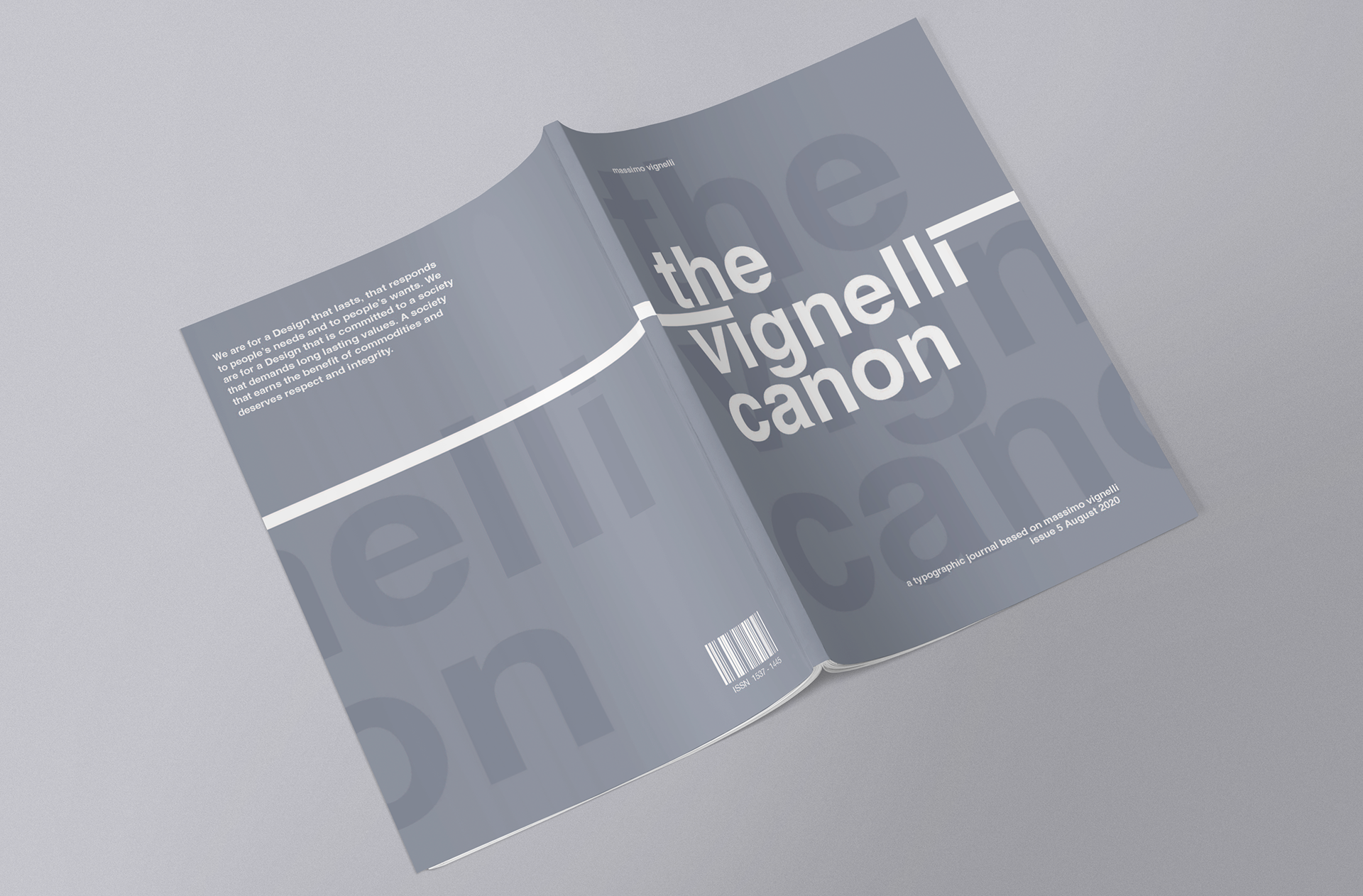
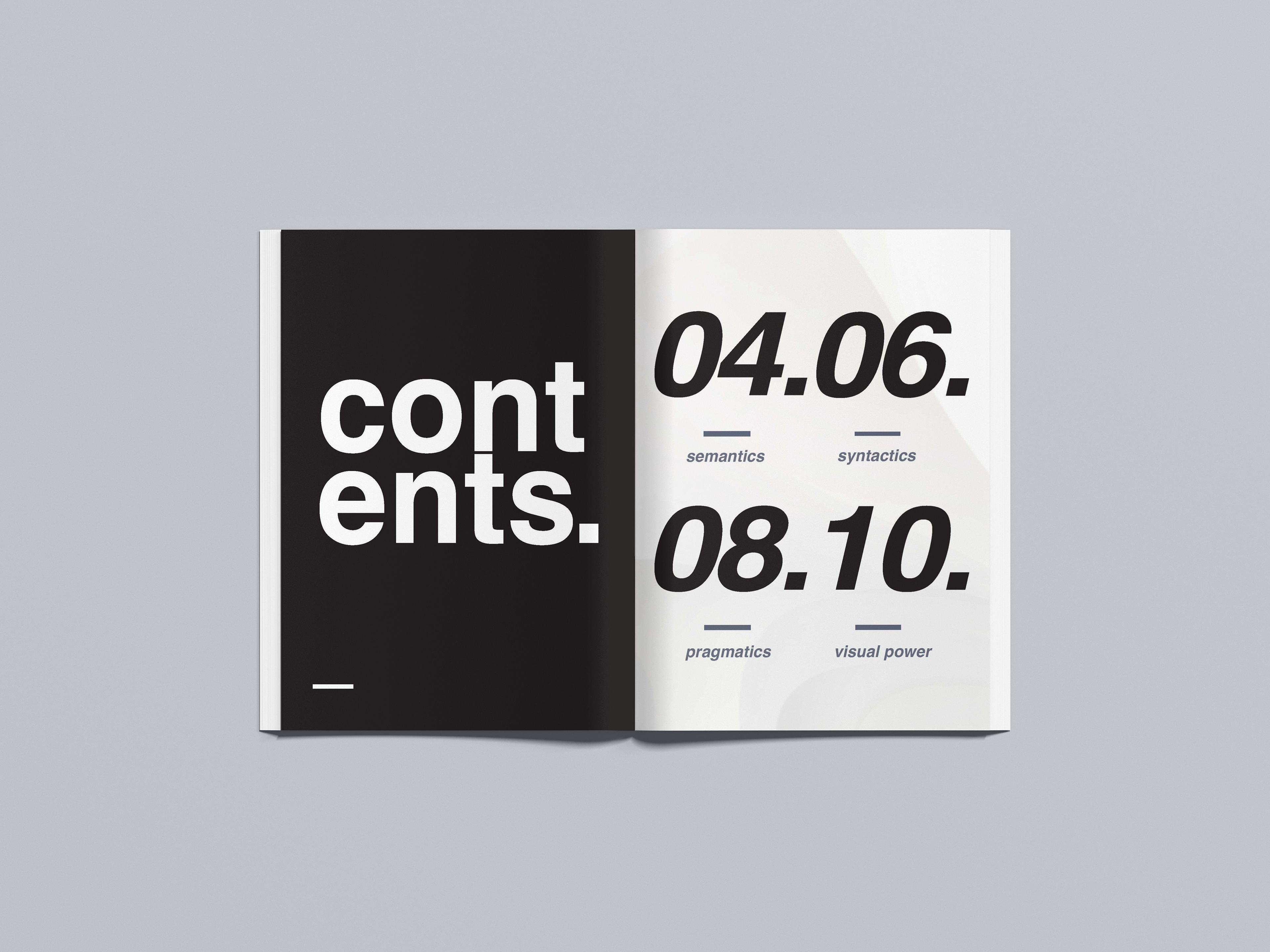
Initially, I aimed to create a vibrant and colourful journal, influenced by Bauhaus design, posters, and colour schemes. However, through much iteration, I realised that incorporating multiple colours detracted from the journal's content and the focus being on text and image layout. This insight led me to adopt a more minimalistic design with a neutral colour scheme, enhancing readability and focus.
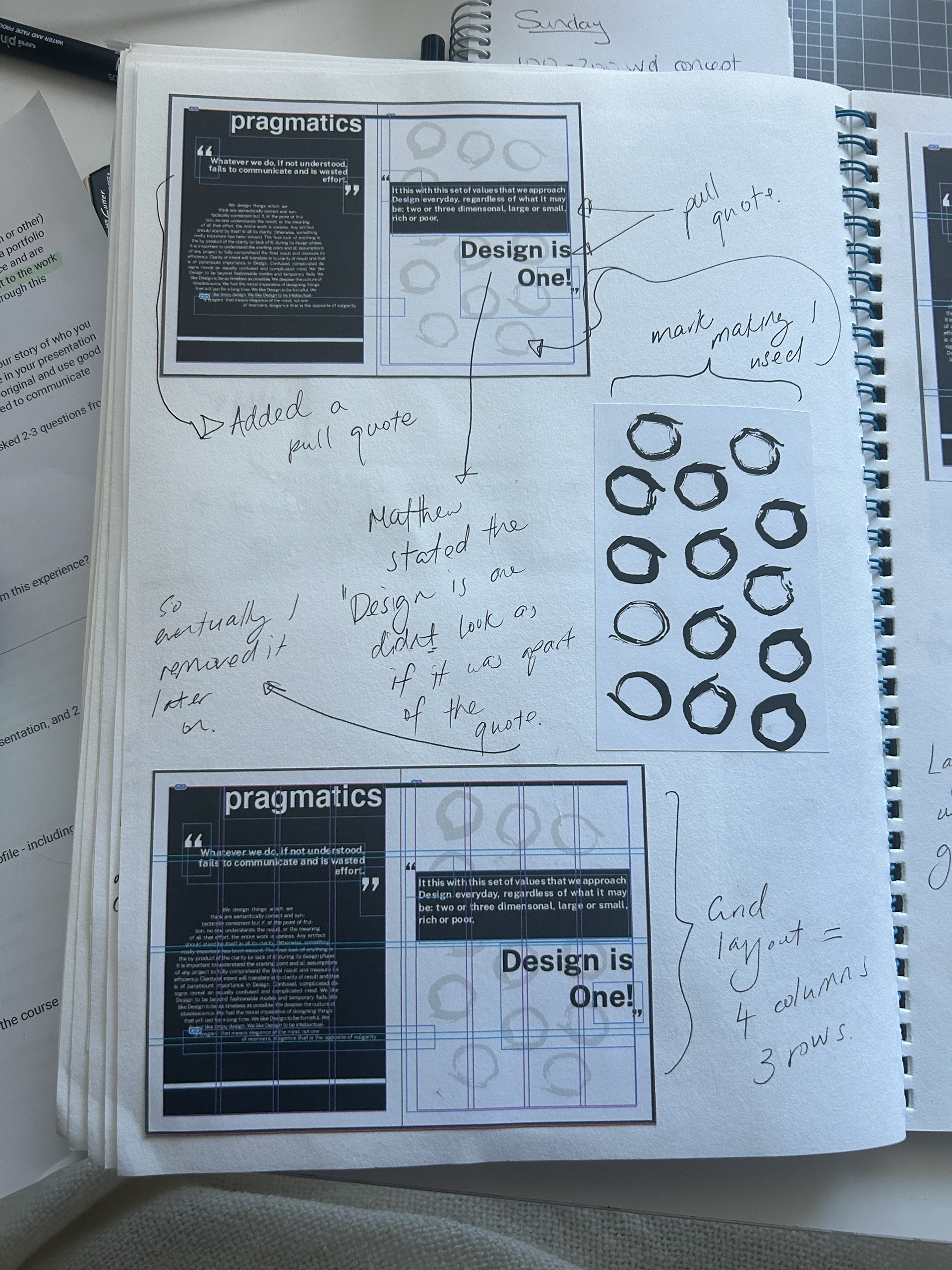
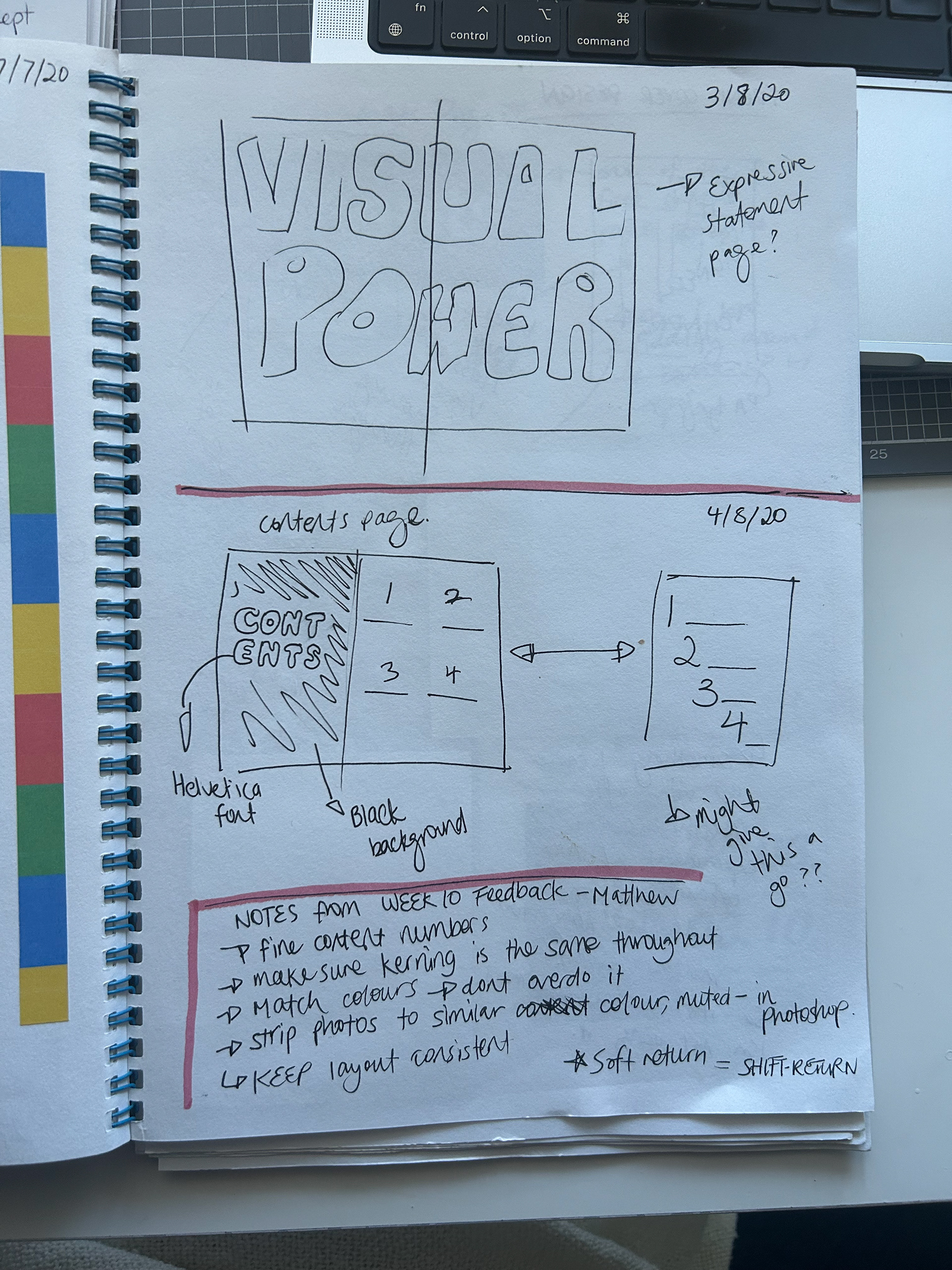
The project also involved experimenting with mark-making, scale, and finishing techniques to refine the overall design. This hands-on approach allowed me to understand the impact of different materials and methods on the final product, emphasising the importance of thoughtful design choices in creating cohesive and impactful work. Mark-making experimentation can be shown on spread three where we were required to play with ink. By balancing creativity with design principles, this project underscores my commitment to producing visually appealing and intentional design.
Spread 1
Spread 2
Spread 3
Spread 4
Spread 5
Spread 6
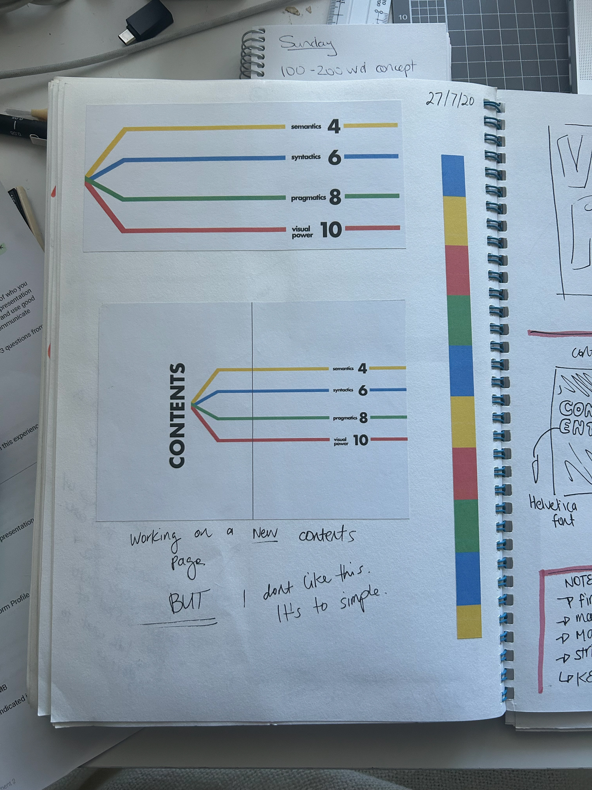
Ideation & Iterative Process